
The Importance of Responsive Design in 2025:
Achieving top-notch web performance requires seamless functionality across every device type.
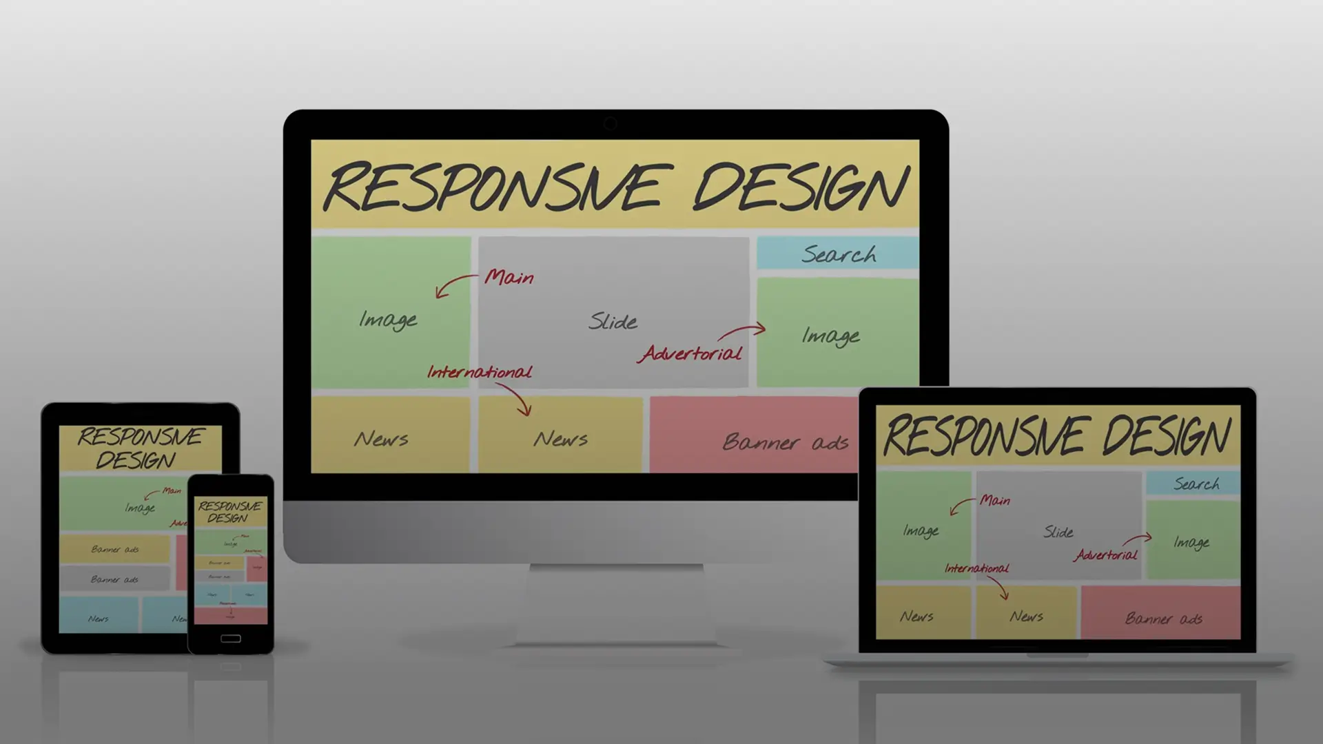
Responsive web design has become a fundamental requirement in the digital age since users access websites through numerous devices. Responsive design allows websites to deliver optimal performance across desktops, laptops, tablets and smartphones. The article examines the critical role responsive web design will play in 2025 by enhancing mobile optimization and cross-device user experience while also driving conversions.
1. Mobile Optimization: Catering to the Mobile-First World
The introduction of smartphones has completely changed our web interaction patterns. The transition to mobile-first indexing by Google along with increased mobile internet use and mobile shopping trends confirm that we exist in a mobile-first world.
Responsive web design represents a vital tool for serving mobile-first audiences effectively. Responsive design enables your website to function well and provide an intuitive user experience on smaller devices. The mobile optimization process includes making navigation menus work smoothly along with images, forms, and content layouts which become easy to access and read on mobile devices.
By 2025, mobile optimization will cover emerging technologies like 5G and augmented reality (AR). The advanced speed and reduced latency of 5G enable users to demand sophisticated and interactive mobile experiences. Responsive web design enables you to utilize new technologies for creating captivating AR experiences or delivering high-resolution video content that loads rapidly and appears visually appealing on mobile screens.
2. Cross-Device User Experience: Consistency is Key
Your website needs to provide uniform experiences because users move between devices like phones and laptops when accessing it. This is where responsive web design comes in.
With responsive design, your website provides identical functionality and cross-device user experience across every device type and screen dimension. The layout alongside images and navigation elements adjust to screen size which enables users to enjoy uninterrupted browsing.
Responsive web design grows in importance in 2025 because new devices such as foldable phones and smartwatches are emerging. Your website needs to demonstrate adaptability to various emerging screen sizes and formats to maintain a uniform, user-friendly, cross-device user experience across all devices.
3. Driving Conversions: A Responsive Website is a Profitable Website
Responsive web design functions as a significant conversion driver beyond its aesthetic and user experience benefits. Users who encounter navigation difficulties or cannot locate needed information on your site are likely to abandon it in favour of a competitor’s website.
Responsive websites keep users engaged for more extended periods which results in higher conversion rates. Mobile optimization boosts your website’s conversion capabilities when call-to-action buttons stand out and are simple to tap on mobile devices and when forms are optimized for mobile use.
Responsive web design offers substantial advantages for search engine optimization. Google gives preferential treatment to mobile-friendly websites which helps responsive sites improve search ranking and draw more organic visitors.
Responsive web design has become essential for modern websites as users browse the web through numerous device types. Responsive design enables your website to deliver optimal functionality across various devices such as desktops, laptops, tablets and smartphones. We will now explore the responsive web design concept and its critical role in the modern digital world.
Fluid grids serve as a fundamental element in responsive design.
Responsive design relies heavily on fluid grids as its fundamental element. Responsive web design uses fluid grids to enable layout elements to resize together which creates adaptable designs for various screen sizes, supporting a smooth cross-device user experience.
How Media Queries Enhance User Experience
Media queries stand as an essential element for achieving responsive web design. Media queries enable the implementation of distinct CSS styles based on specific user device features like screen width and device orientation, contributing to more effective mobile optimization.
Flexible images serve as powerful tools for optimizing mobile experiences.
Flexible images function by automatically scaling and resizing themselves to match various screen dimensions. Your images display beautifully across all devices which enhances the overall mobile optimization and cross-device user experience.
White Label Ninja – Your Trusted Partner in Web Design
White Label Ninja acknowledges how responsive web design significantly improves website user experience while boosting SEO and conversion rates. Our expert team possesses extensive experience in creating responsive designs which deliver outstanding performance across all device types with strong mobile optimization and cross-device user experience.
From initial construction through enhancement, we provide continuous support for your website development journey. With our complete range of services like white-label web design & development and more, you get all necessary tools to create a successful responsive website.
Do you want to upgrade your internet visibility through responsive website design? Reach out to White Label Ninja today to improve your web presence! We will partner to build a website that delivers perfect performance and stunning visuals across every device through seamless cross-device user experience and powerful mobile optimization.
Want to upgrade your website with responsive design features? Reach out to our team of professional web designers right now. Our combined efforts will produce a website with amazing aesthetics and flawless functionality through mobile optimization and cross-device user experience across all platforms.